


Crowding
The world is complex, and our vision must distinguish many things from each other, even when they are numerous and close together.
Eye charts are designed with the crowding effect in mind for several reasons, all aiming to ensure accurate and reliable visual acuity measurements and improve the diagnostic process:
- Representative of real-world situations: In reality, people often encounter situations where objects are closely packed together, such as when reading fine print or navigating a busy street. By including the crowding effect on eye charts, the optometrist can better assess how a person’s vision will function in real-life situations.
- Diagnosis of visual disorders: The crowding effect may be more pronounced in individuals with certain visual impairments, such as amblyopia (“lazy eye”) or dyslexia. By evaluating how crowding affects a person’s ability to read the eye chart, the optometrist can more effectively detect and diagnose these conditions.
- Differentiating between normal and abnormal vision conditions: The crowding effect can vary between individuals with normal vision and those with certain visual impairments. By observing how crowding affects a person’s visual acuity, the optometrist can differentiate between normal vision conditions and those that indicate an underlying visual disorder.
- Optimization of visual acuity measurements: By including the crowding effect on eye charts, the optometrist can obtain more accurate and reliable visual acuity measurements. This can help ensure that the patient receives the correct prescription for glasses or contact lenses and the most suitable vision correction.
Overall, the design of eye charts with the crowding effect contributes to improving diagnostic accuracy and clinical assessment of a person’s visual ability, resulting in better treatment and care of vision-related problems.

Horror Vacuum – the fear of the empty space…
In some cases, when an ad is overcrowded with too much information, images, or graphic elements, it can be referred to as a victim of “horror vacuum.”
When an ad suffers from “horror vacuum” in this way, it can be difficult for the audience to focus or understand the message clearly due to the visual noise and overload. This can result in feelings of confusion, frustration, or even indifference among those who view the ad.
To avoid this form of “horror vacuum,” it is important for designers to create ads that are well-balanced, simple, and easy to read. This may involve limiting the amount of information, images, or graphic elements and ensuring that each element serves a purpose and contributes to the overall effectiveness of the ad.
Horror Vacuum – on eye charts!
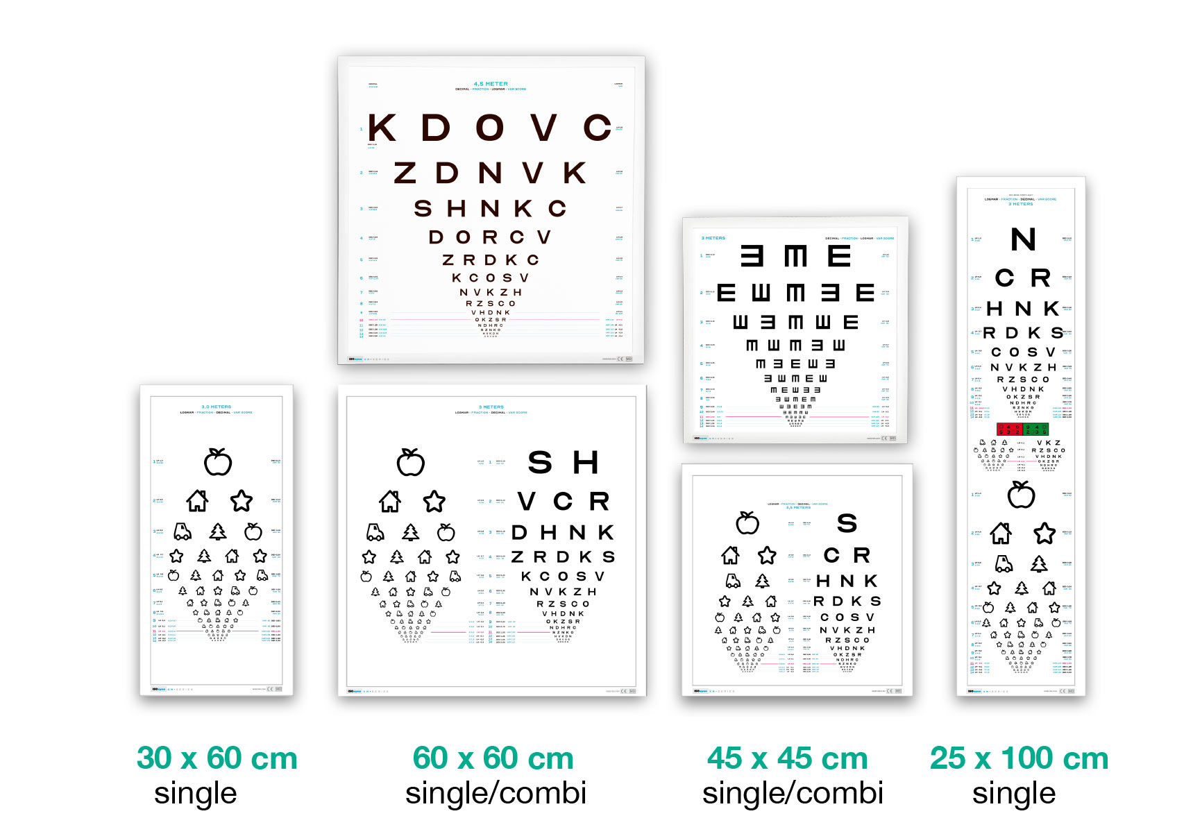
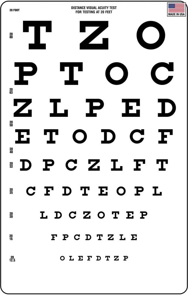
The design of eye charts seems to suffer from exactly “Horror Vacuum,” as if the entire board must be filled at all costs, even if it significantly impairs the result and the ability to compare vision tests.
As we move down the chart and the figures/letters get smaller, an arbitrary number of extra figures/letters are loaded onto the row. On one hand, this shifts the difficulty level, but on the other, it compensates by having the small characters spaced widely apart.
![]()